I can’t help but love people who want to decorate their homes with inspiring art. Many do it so beautifully. They may just have great design instincts or have been trained to decorate. But let’s be frank—some of you (God bless your hearts) will admit that you don’t have a clue how to properly display art. You love art. You buy a painting or perhaps a lovely photograph—and you hang it somewhere—but you’ve never been taught how to really make art “work” in a room setting.
Some of you grew up with little or no training in this area of life and beauty. You weren’t raised by Martha Stewart or Candice Olson—not even close. Maybe your dad proudly had some deer antlers mounted and hung them way too high on a wall. Maybe your mom was not too thrilled with his attempt to decorate but she didn’t want to burst his bubble. Maybe art was a non-entity in your childhood home—except for your elementary school drawings held up with free refrigerator magnets. (I still have a drawing on my fridge from when I was 7 years old.)
It was not until I went to art school that I finally learned something about displaying art. We visited art galleries and museums, observing not just the art, but how it was displayed professionally. We learned whether to frame or not to frame a piece, how to make the frame complement the piece, and at what height to hang the art on a wall. Granted, it was not as thorough as an interior designer’s education but we picked up some good fundamentals.
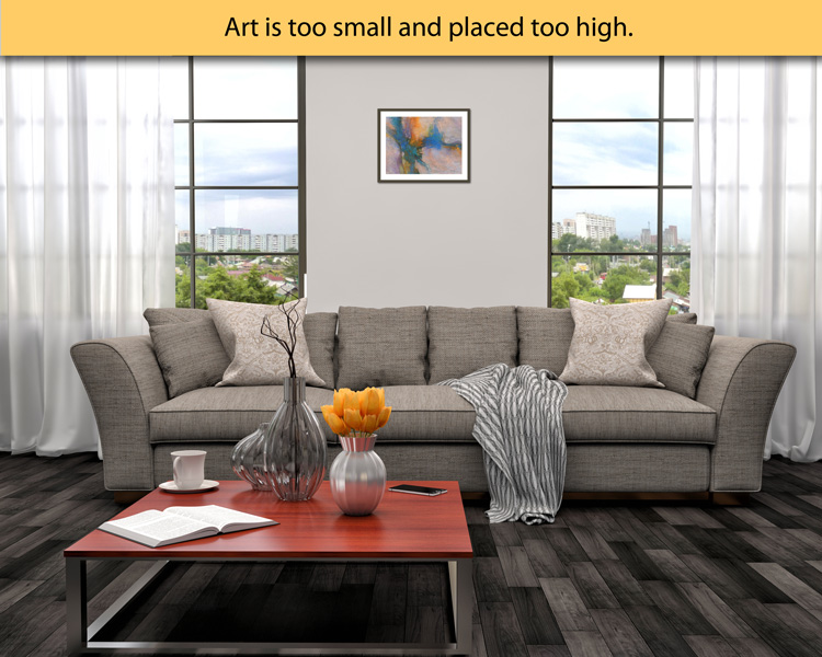
Many people simply hang art way too high in their rooms. It’s floating up near the ceiling and is not anchored visually to any furniture or other art. This a “no-no.” It tends to look like an afterthought instead of a plan. Sometimes the art is also too small for the space. This makes it seem even more as though it’s floating in a sea of wall space without any rhyme or reason.
So, let’s talk about it. How can you improve the way you’re displaying art on a wall? As a general rule of thumb, it is best to hang art so that you can walk up to it and actually see it’s details without straining your neck. The center of the photo or painting should be roughly at your eye level or slightly higher. This can vary slightly depending on what furniture is nearby and the amount of space on the wall or height of the ceiling. I’ve read decorating articles that say it should always be centered at 54 inches from the floor. Some say 57 inches. Some say 62 inches. I think this may depend on how tall you are and what feels comfortable. I prefer 60 inches as the center height for art in my home.
Below is an example of a contemporary painting that is too small for the space and placed too high on the wall. The mat is too narrow, almost choking the artwork. I prefer to always be generous with mat sizing. Less is NOT more in this case.
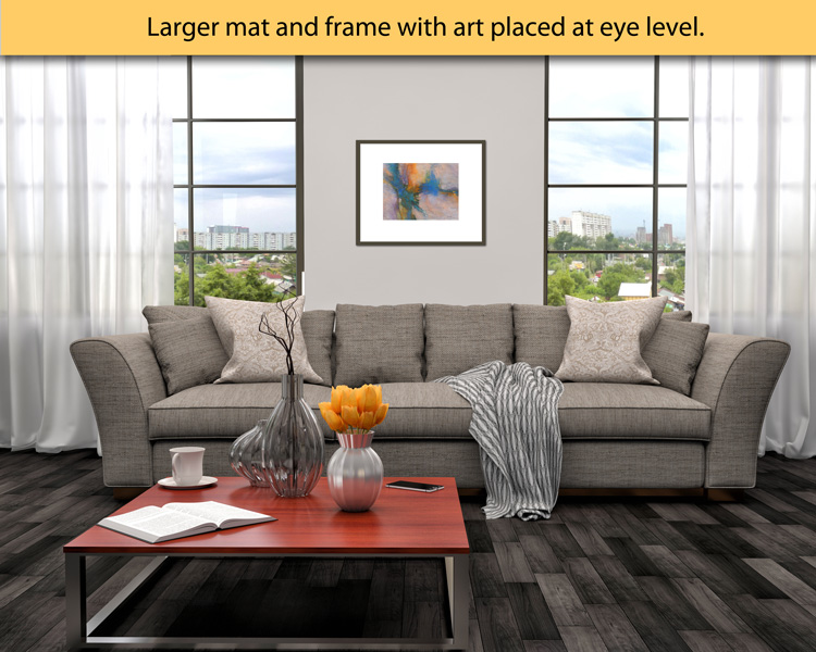
Now, here’s how the same piece of art could actually work better in the room (see image below.) The size of the painting itself has not changed but the mat and frame are larger, giving some space around the art for the eye to rest. It’s placed closer to eye level and is now more anchored to the furniture in the room. It looks more purposeful and fits the space a bit better.
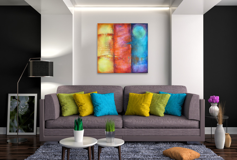
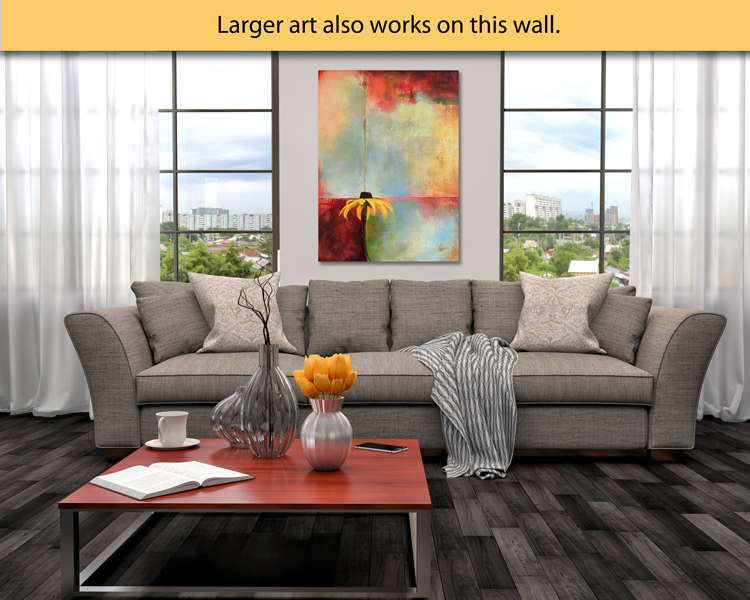
If you have some art that is just not working well in your room, take a look at the scale/size of the art compared to the wall space. Try lowering it to eye level. If it’s too small, consider getting a larger frame and mat… or group it with some other pictures. (I hope to talk about groupings in another blog post. But the same rule basically applies—measure the entire layout of the group and try to keep the center at eye level.) You could also move the art to another wall where it fits more comfortably and make a new plan for the empty space you now have. In this room interior, something big and bold like this painting (below) would also work nicely and makes a bold statement.
I’d love to hear your comments, thoughts or questions.